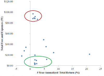
Last month we had a blog post introducing the FINRA Mutual Fund Expense Analyzer tool. In this post we apply it to the 25 largest mutual funds and ETFs measuredby net asset value using data from Morningstar. We assumed for this calculation an initial investment of $1,000 held for five years, and plot the total fees and sales charges over that period against the historical 5 year annualized total return of the fund:
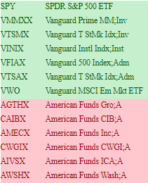
There is no clear linear relationship between returns and fees as depicted in the graph; however, it is interesting to point out the cluster of funds with high fees between $80 and $100 and returns around 1-2% return are all from a single issuer, American Funds, as shown in the red circle. And the cluster of funds with low fees but similar returns, shown in the green circle, are all from Vanguard with the only exception of the SPDR S&P 500 ETF (ticker: SPY). The table below shows the list of funds in the green circle (marked as green) and those in the red circle (marked as red) together with their tickers.